Have you ever wondered what drives a customer to choose your product in a store? While brand loyalty often plays a role, what happens when someone picks an entirely new product? In many cases, it’s the design of the label that motivates the choice amidst dozens of similar options on the shelf.

The importance of label design
A compelling label design is crucial for grabbing the customer’s attention and influencing their purchasing decision. A label has only a few seconds to make an impression and convince the buyer of the product's quality and value. A well-designed label can evoke emotions, communicate essential information, and differentiate a product from its competitors. But why does the same product sell better with one design over another?
1. Legible labels
A label must be easily readable, even from a distance. To achieve this, focus on:
- Contrast: Ensure sufficient contrast between text and background by selecting complementary colors.
- Font Size: Key details like the product name and brand should be significantly larger than supplementary text.
- Font Style: Use clear, simple fonts without unnecessary decorative elements. Sans-serif fonts are often a good choice for primary text.
- Spacing: Leave enough space between lines and sections to avoid a cluttered appearance.
2. Attractive graphics
Visual elements such as images and graphics enhance the text on a label. They can grab attention, distinguish your product from competitors, and evoke the right emotions in customers. Consider:
- Illustrations and Photos: For instance, juices are often associated with fruits, while sparkling water evokes bubbles. Always work with experienced graphic designers who understand current trends.
- Icons, Shapes, and Symbols: These elements should harmonize as a cohesive whole, support the brand message, and avoid being distracting. With today's printing technologies, even the finest details can be achieved.
- Colors: Colors evoke emotions and associations with specific qualities. Beverages may use vibrant hues, while cosmetics might opt for softer or premium tones with matte finishes.
- Placement: Graphics should complement the text rather than overshadow it. For wrap-around labels, ensure the design flows seamlessly across joins.
3. White space
White space—or "negative space"—is an essential design element that:
- Highlights important features like text or graphics.
- Creates balance and harmony.
- Guides the customer’s eye to key areas.
- Adds an air of sophistication and premium quality.
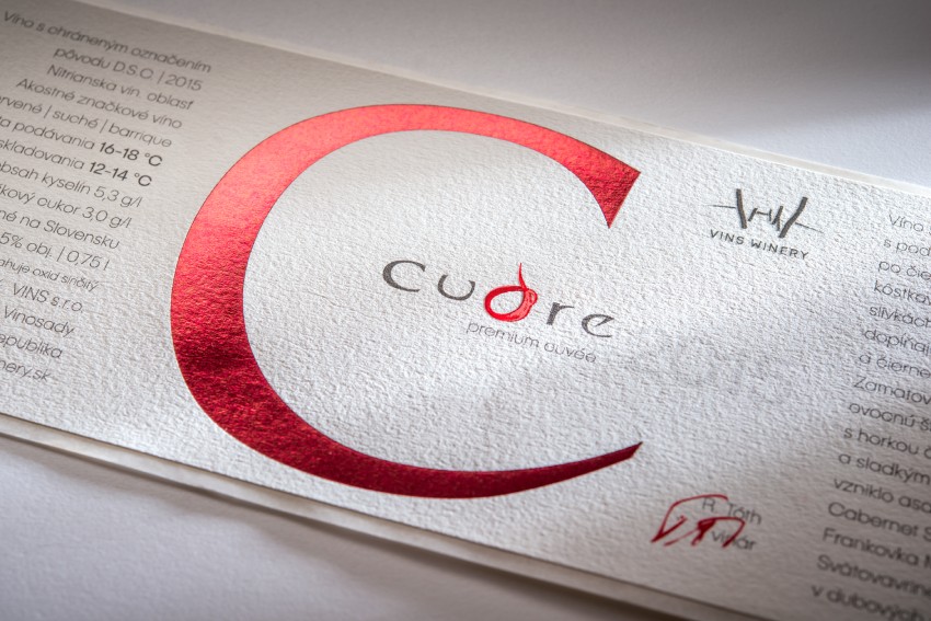
Avoid filling every millimeter of the label. Allow text and graphics to "breathe," giving them room to stand out. For example, leaving empty space around logos or product names emphasizes their importance. And this applies to smaller self-adhesive labels as well, not just the large ones.
So, don’t be afraid of empty space—use it intentionally. It will make your label more appealing.
4. High-quality materials
The tactile experience of holding a product often speaks volumes about its quality. Customers subconsciously assess whether they’re handling a premium item or just another generic product based on:
- Material Choice: Opt for substrates that feel pleasant to touch and look high-quality. For beverages, waterproof films may be suitable, while luxury papers work well for cosmetics.
- Printing Effects: Modern printing technologies can apply embossed stamping, metallic colors, glossy or matte laminations, as well as spot UV coating, even on cut and die-cut labels.
- Product Fit: The material and finish should align with the product type—for instance, an exclusive gin bottle versus a carton of fruit juice.
5. Strategic layout
The arrangement of elements on your label should guide the eye naturally from the most important information to secondary details:
- The product name and brand must be prominent and instantly visible.
- Highlight key attributes like "non-GMO," "vegan," "gluten-free," or "sugar-free" immediately after the name and brand.
This hierarchy ensures that customers quickly grasp what sets your product apart.
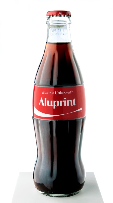
Designing labels may seem complex at first glance, but it’s an art we’ve mastered over 31 years of collaboration with renowned brands like Coca-Cola, Mattoni, Kofola, and others. By combining thoughtful design principles with modern printing techniques, you can create labels that not only look great but also drive sales.

